1. Inspiration
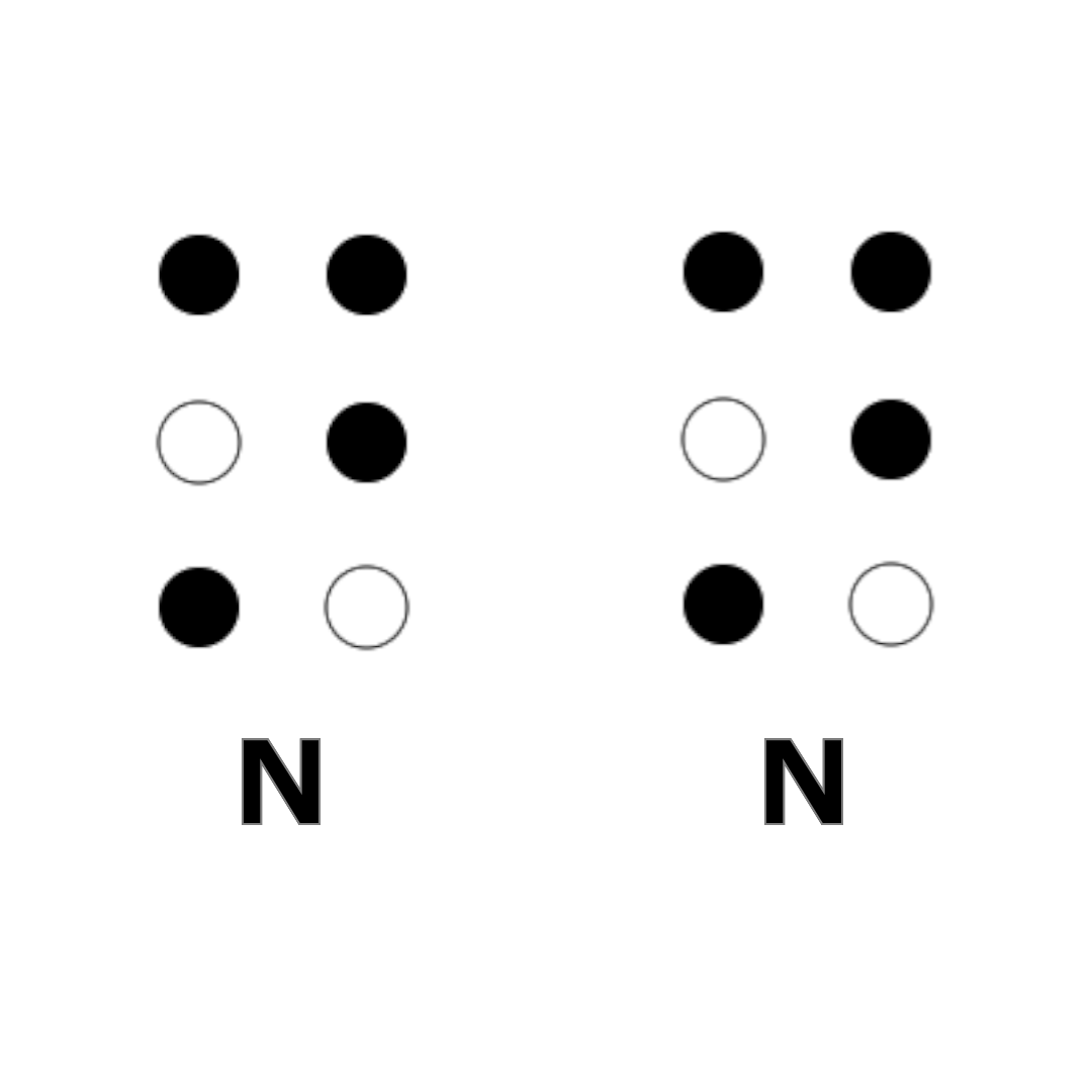
Blindenschrift
My first and last name both end with the letter N.
2. From Blindenschrift to the Large N
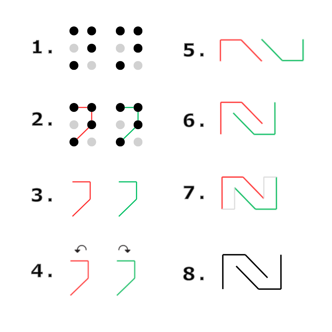
From two Ns, I designed a large N with two hidden Ns inside.
3. Multiple Versions
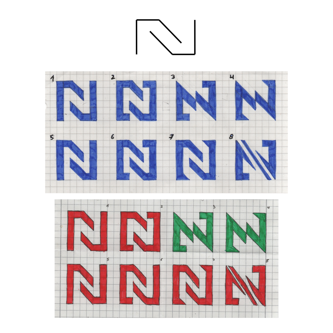
After that, I created several versions and finally selected two of my favorites.
4. Favorites Evolved
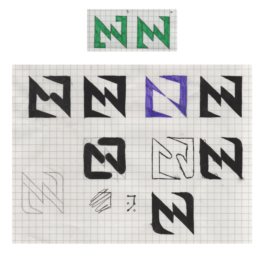
From these two versions, I created further versions until I finally found the perfect one.
5. Digital Version
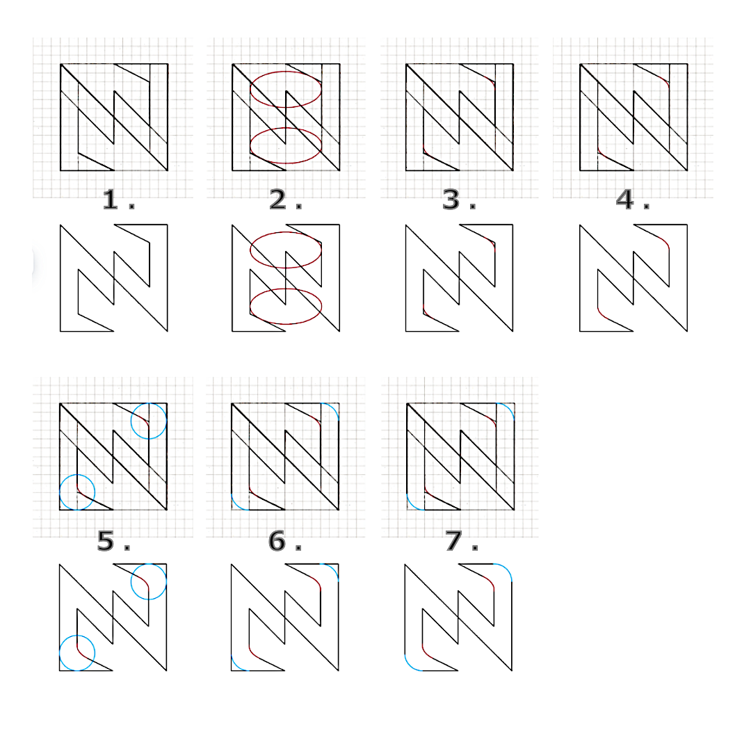
Subsequently, I created a square sketch and from it, a digital version.
6. Final Logo
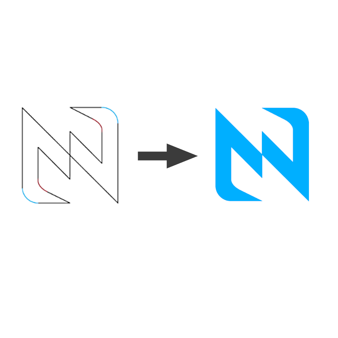
So the final logo was created.
7. Different Color Combinations
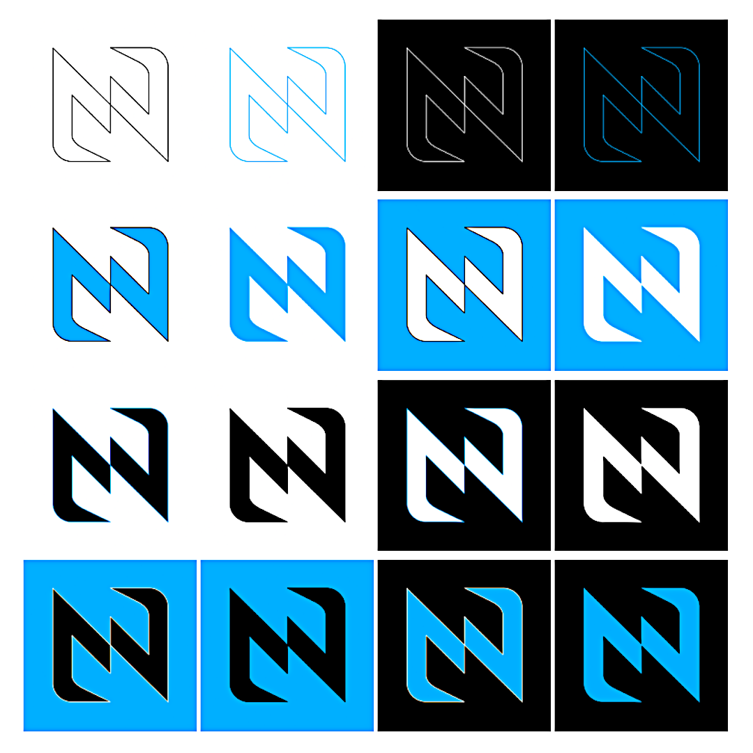
Here is the logo in different colors and color combinations.
Instagram ⇒
Important Information
General
The logo of „NIOZCO“ was completely independently developed and designed.
In contrast to the later visual representation of the figure, no AI-supported tools were used during the development of the logo.
Das gesamte Logo entstand ausschließlich durch eigene Ideen, eigene Konzepte, eigene Skizzen und eigene kreative Ausarbeitung.
Origin of the Idea
The basic idea behind the logo originated from the letter "N".
Both my first and last name end with the letter "N", which made this letter the central basis for the entire design.
Additionally, Braille served as creative inspiration for the initial forms and structures.
From this idea, a unique visual concept developed step by step.
From the Idea to the Concept
The development began with:
- Initial considerations,
- simple sketches,
- geometric forms,
- and various possibilities to creatively represent the letter "N".
That is how the idea came about.:
- to develop a large "N",
- in which additional "N" shapes are integrated.
That is how the idea came about.:
- to develop a large "N",
- in which additional "N" shapes are integrated.
As a result, the logo acquired a distinct structure and a unique recognizability..
From the Idea to the Concept
The development began with:
- own drawings,
- own designs,
- own form ideas,
- own further developments,
- own adjustments,
- as well as various ways to creatively represent the letter "N".
In the course of development,:
- various forms were tested,
- different line styles were experimented with,
- multiple design directions were compared,
- and different color variants were created.
As a result, the logo acquired a distinct structure and a unique recognizability..
Development Steps
The creation of the logo proceeded through several stages:
- Inspiration through Braille and the letter "N"
- First own sketches and forms
- Development of various variants
- Selection and further development of favorites
- Creation of a digital version
- Fine adjustments to form and line execution
- Development of various color combinations
- Finalization of the ultimate logo
Each of these steps was independently completed.
No Use of Foreign Designs
The logo is not based on:
- existing brands,
- foreign logos,
- known symbols,
- foreign characters,
- or copied designs.
The entire design was developed independently and constitutes an original creative design..
Own Visual Identity
The logo forms the central foundation of the entire visual identity of "NIOZCO".
It is used consistently and permanently:
- on the website,
- within the figure,
- in emojis,
- on graphics,
- in projects,
- as well as on various platforms.
Thus, the logo developed into a distinctive recognition feature.
Meaning of the Logo
The logo doesn't just represent a single letter, but something else entirely.:
- the entire creative identity,
- the projects,
- the development,
- as well as the visual representation of "NIOZCO".
Through the clear form, the fixed color scheme, and the characteristic structure, the logo possesses a high recognizability.
Copyright of the Logo
The logo was completely independently created and is subject to the own creative development of the creator of "NIOZCO".
Since no AI or foreign templates were used in its creation, the entire design is based solely on original creative work.
The logo may therefore not be copied, transferred, modified, further distributed, or presented as an own design without express permission:
- copied,
- transferred,
- modified,
- further distributed,
- or presented as an own design without express permission.
All rights to the original design and the developed variants remain with the creator of "NIOZCO".
Documentation of the Development
The development of the logo was documented through various intermediate stages..
These include, among others,:
- First Sketches,
- Development Drawings,
- Digital Designs,
- Various Variants,
- Color Tests,
- as well as final designs.
This allows for a complete understanding of the logo's development.
Conclusion
The logo „NIOZCO“ was created entirely from original ideas, drawings, and creative development.
From initial sketches to the final digital version, each step was independently designed and further developed.
Thus, a unique logo with its own visual identity, clear recognizability, and central significance for the entire „NIOZCO“ project was created.